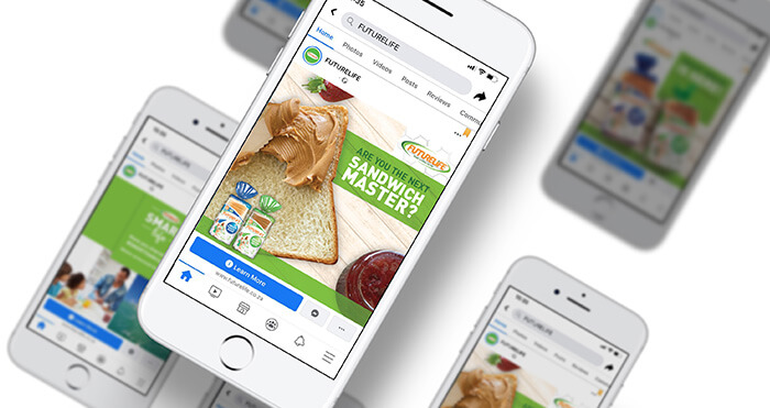

Our business has impacted various categories across 7 sectors. Take a look at how our we have previously brought successful campaigns to life.

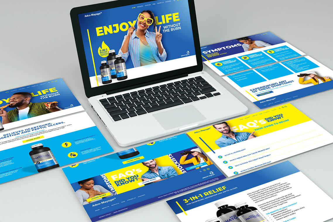
Case Studies
See how we have created demand through unique, creative solutions to meet our partner's business needs.
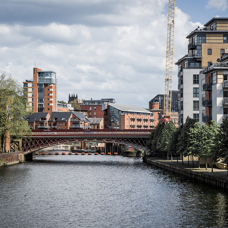
Leeds - United Kingdom
The Ambler Club, St. Pauls House, 23 Park Square, Leeds, LS1 2ND, United Kingdom
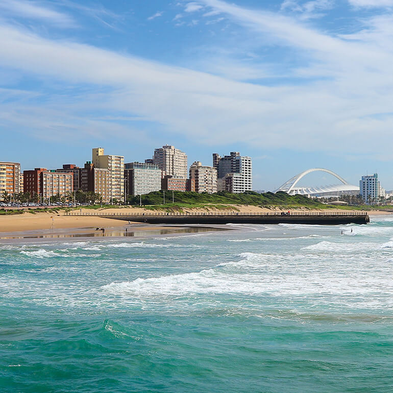
Durban - South Africa
Lambert Road, Morningside, Durban, South Africa
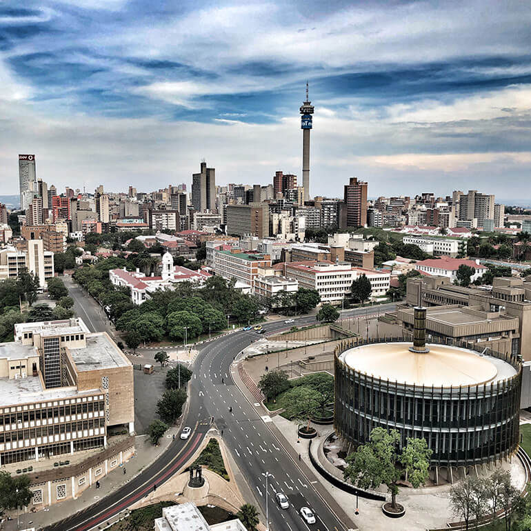
Johannesburg - South Africa
Johannesburg, South Africa
Offices.
Leeds, United Kingdom
Durban, South Africa
Johannesburg, South Africa